Real Potatoes. Bolder Flavors.
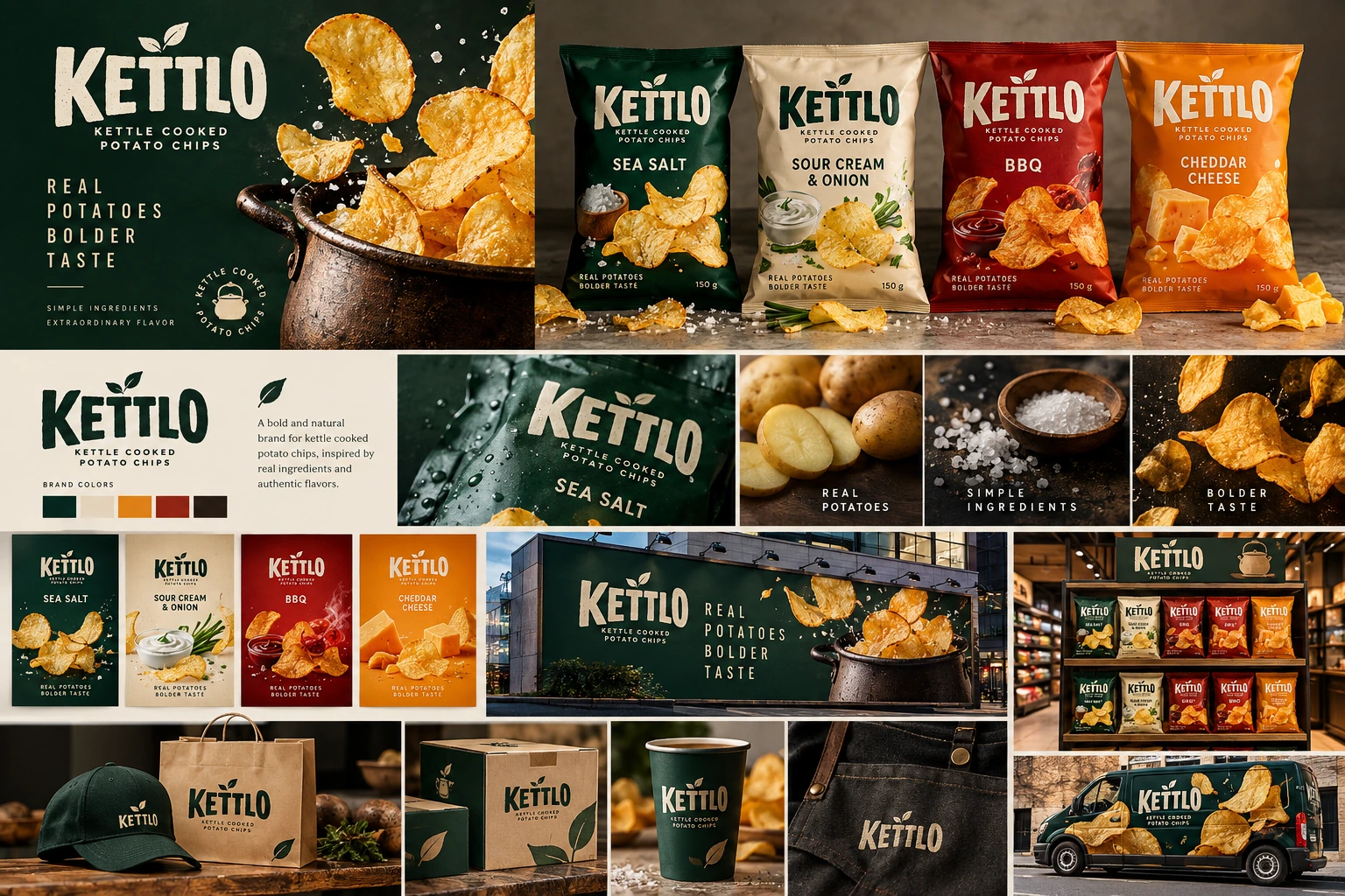
A self-initiated packaging concept for a modern kettle-cooked potato chip brand. The system is built around one strong wordmark, four flavor colors and a repeatable packaging architecture designed to stay recognizable from shelf to social.
The goal was to build a portfolio project that reads like a real packaging assignment: clear positioning, a disciplined identity, flavor architecture, shelf logic and campaign applications. The four core flavors remain fixed throughout the case study.
KETTLO combines rustic food cues with a sharper contemporary layout. The visual language avoids overly decorative packaging and instead relies on a bold wordmark, confident blocks of flavor color and simple potato-chip imagery.
The identity is deliberately compact: a strong serif wordmark with a leaf accent, a natural dark green master color, warm cream for breathing space and four functional flavor colors.
Every SKU keeps the same hierarchy: brand at the top, product descriptor below, flavor in the middle and a strong food zone at the base. Color does the fast recognition work while layout remains constant.
The process section makes the case study useful to a recruiter: it shows how the brand was narrowed from rough directions into a repeatable pack system instead of presenting only polished mockups.
Define the balance between rustic food character and a cleaner modern shelf presence.
Keep the mark highly visible and avoid decorative elements that compete with the food.
Lock the hierarchy first; let color and ingredient cues create flavor differentiation.
Extend the same system into social, retail and outdoor applications to verify consistency.
The campaign system uses the dark green master color, the large wordmark and product-color accents so the brand remains recognizable in fast environments such as supermarket aisles, mobile feeds and outdoor advertising.
One message. One pack. High recognition at distance.
A packaging case study designed to demonstrate brand thinking, consistency and presentation—not simply a collection of generated visuals. AI assistance is part of the disclosed workflow, while the final portfolio story focuses on the design system and the decisions behind it.
Back to BADR portfolio →